Tag Archives: data visualizations

India has 100k records on iNaturalist

22 Apr

Biodiversity citizen scientists use iNaturalist to post their observations with photographs. The observations are then curated there by crowd-sourcing the identifications and other trait related aspects too. The data once converted to “research grade” is passed on to GBIF as occurrence records.

Exciting news from India in 3rd week of April 2019 is:

Being interested in biodiversity data visualizations and completeness, I was waiting for 100k records to explore the data. Here is what I did and found out.

Step 1: Download the data from iNaturalist website. Which can be done very easily by visiting the website and choosing the right options.

https://www.inaturalist.org/observations?place_id=6681

I downloaded the file as .zip and extracted the observations-xxxx.csv. [In my case it was observations-51008.csv].

Step 2: Read the data file in R

library(readr)
observations_51008 <- read_csv("input/observations-51008.csv")

Step 3: Clean up the data and set it up to be used in package bdvis.

library(bdvis)

inatc <- list(
  Latitude="latitude",
  Longitude="longitude",
  Date_collected="observed_on",
  Scientific_name="scientific_name"
)

inat <- format_bdvis(observations_51008,config = inatc)

Step 4: We still need to rename some more columns for ease in visualizations like rather than ‘taxon_family_name’ it will be easy to have field called ‘Family’

rename_column <- function(dat,old,new){
  if(old %in% colnames(dat)){
    colnames(dat)[which(names(dat) == old)] <- new
  } else {
    print(paste("Error: Fieldname not found...",old))
  }
  return(dat)
}

inat <- rename_column(inat,'taxon_kingdom_name','Kingdom')
inat <- rename_column(inat,'taxon_phylum_name','Phylum')
inat <- rename_column(inat,'taxon_class_name','Class')
inat <- rename_column(inat,'taxon_order_name','Order_')
inat <- rename_column(inat,'taxon_family_name','Family')
inat <- rename_column(inat,'taxon_genus_name','Genus')

# Remove records excess of 100k
inat <- inat[1:100000,]

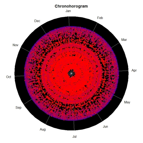
Step 5: Make sure the data is loaded properly

bdsummary(inat)

will produce some like this:

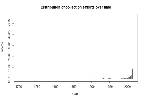
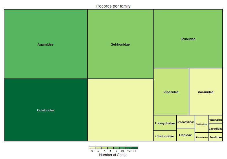
Total no of records = 100000 

 Temporal coverage...
 Date range of the records from  1898-01-01  to  2019-04-19 

 Taxonomic coverage...
 No of Families :  1345
 No of Genus :  5638
 No of Species :  13377 

 Spatial coverage ...
 Bounding box of records  6.806092 , 68.532  -  35.0614769085 , 97.050133
 Degree celles covered :  336
 % degree cells covered :  39.9524375743163

The data looks good. But we have a small issue, we have some records from year 1898, which might cause trouble with some of our visualizations. So let us drop records before year 2000 for the time being.

inat = inat[which(inat$Date_collected > "2000-01-01"),]

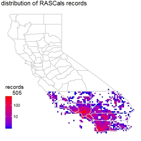
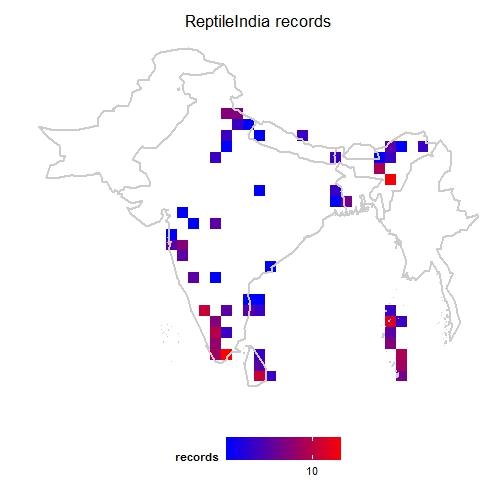
Now we are ready to explore the data. First one I always like to see is geographical coverage of the data. First let us try it at 1 degree (~100km) grid cells. Note here I have Admin2.shp file with India states map.

mapgrid(inat,ptype="records",bbox=c(60,100,5,40),
        shp = "Admin2.shp")

mapgrid1_c

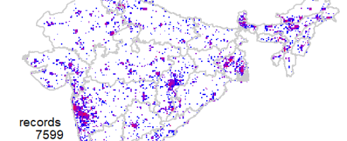
This shows a fairly good geographical coverage of the data at this scale. We have very few degree cells with no data. How about fines scale though? Say at 0.1 degree (~10km) grid. Let us generate that.

mapgrid(inat,ptype="records",bbox=c(60,100,5,40),
        shp = "Admin2.shp",
        gridscale=0.1) 

mapgrid2_c

Now the pattern is clear, where the data is coming from.

To be continued…

References

Mapping Biodiversity data on smaller than one degree scale

23 Feb

Guest Post by Enjie (Jane) LI

I have been using bdvis package (version 0.2.9) to visualize the iNaturalist records of RAScals project (http://www.inaturalist.org/projects/rascals).

Initially, the mapgrid function in the bdvis version 0.2.9 was written to map the number of records, number of species and completeness in a 1-degree cell grid (~111km x 111km resolution).

I applied this function to the RASCals dataset, see the following code. However, the mapping results are not satisfying. The 1 degree cells are too big to reveal the details in the study areas. Also, the raster grid was on top the basemap, which makes it really hard to associate the mapping results with physical locations.

library(rinat)
library(bdvis)

rascals=get_inat_obs_project("rascals")
conf <- list(Latitude="latitude",
             Longitude="longitude",
             Date_collected="Observed.on",
             Scientific_name="Scientific.name")
rascals <- format_bdvis(rascals, config=conf)
## Get rid of a record with weird location log
rascals <- rascals[!(rascals$Id== 4657868),]
rascals <- getcellid(rascals)
rascals <- gettaxo(rascals)
bdsummary(rascals)

a <- mapgrid(indf = rascals, ptype = "records",
             title = "distribution of RASCals records",
             bbox = NA, legscale = 0, collow = "blue",
             colhigh = "red", mapdatabase = "county",
             region = "CA", customize = NULL)

b <- mapgrid(indf = rascals, ptype = "species",
              title = "distribution of species richness of RASCals records",
              bbox = NA, legscale = 0, collow = "blue",
              colhigh = "red", mapdatabase = "county",
              region = "CA", customize = NULL)

rascals01

rascals02

I contacted developers of the package regarding these two issues. They have been very responsive to resolve them. They quickly added the gridscale argument in the mapgrid function. This new argument allows the users to choose scale (0.1 or 1). The default 1-degree cell grid for mapping.

Here are mapping results from using the gridscale argument. Make sure you have bdvis version 0.2.14 or later.

c <- mapgrid(indf = rascals, ptype = "records",
             title = "distribution of RASCals records",
             bbox = NA, legscale = 0, collow = "blue",
             colhigh = "red", mapdatabase = "county",
             region = "CA", customize = NULL,
             gridscale = 0.1)

d <- mapgrid(indf = rascals, ptype = "species",
             title = "distribution of species richness of RASCals records",
             bbox = NA, legscale = 0, collow = "blue",
             colhigh = "red", mapdatabase = "county",
             region = "CA", customize = NULL,
             gridscale = 0.1)

rascals03

rascals04

We can see that the new map with a finer resolution definitely revealed more information within the range of our study area. One more thing to note is that in this version developers have adjusted the basemap to be on top of the raster layer. This has definitely made the map easier to read and reference back to the physical space.

Good job team! Thanks for developing and perfecting the bdvis package.

References

Creating figures like the paper ‘Completeness of Digital Accessible Knowledge of Plants of Ghana’ Part 4

13 Dec

This is the fourth part of the of the post where are going to create figure 4 Plot of Inventory Completeness against sample size for grid cells. Part 3 of this series we created chronohorogram for understanding seasonality by year of the data records.

If you have not already done so, please follow steps in Part 1 of the post to set up the data. Since this functionality was recently added to package bdvis, make sure you have v 0.2.9 or higher installed on your system.

The first step to generate this plot will be to compute completeness of the data. Package bdvis provides us with a handy function for that, as long as we want to compute the completeness for a degree grid. This was partially covered in an earlier blog post.

comp = bdcomplete(occ)

This command would return a completeness data matrix called comp and generate a plot of inventory completeness values (c) versus number of spices observed (sobs) in the data set as follows.

comp1

head(comp)
   Cell_id nrec   Sobs  Sest      c
 1 35536   3436   243   276.3514  0.8793151
 2 35537   4315   299   318.7432  0.9380592
 3 35538   518    152   187.4118  0.8110483
 4 35896   17148  320   343.9483  0.9303724
 5 35897   7684   300   338.8402  0.8853732
 6 35898   865    169   216.7325  0.7797632


The data returned has cell identification numbers, number of records per cell, number of observed and estimated species and the completeness coefficient (c).

The default cut off number of records per grid cell is 50, but let us set that to 100 so we can filter out some grid cells which are data deficient.

comp = bdcomplete(occ, recs=100)

The graph we want to plot is Inventory Completeness (c) against sample size for grid cells (nrec) and not the one provided by default.

plot(comp$nrec, comp$c, main="Completeness vs number of species",
     xlab="Number of species", ylab="Completeness")

Will produce a graph like this:

comp2


The problem with this graph is since there is very high variation in number of records per grid cell, majority of points having less than 5000 records are getting mixed up. So let us use log scale for number of records.

plot(log10(comp$nrec), comp$c, main="Completeness vs number of species",
     xlab="Number of species", ylab="Completeness")

comp3

Now this looks better. Let us change the x axis labels to some sensible values, to make this graph easy to understand. For that we will remove the current x axis labels by using xaxt parameter and then construct and add the tick marks and values associated.

plot(log10(comp$nrec),comp$c,main="Completeness vs number of species",
     xlab="Number of records",ylab="Completeness",xaxt="n")
atx <- axTicks(1)
labels <- sapply(atx,function(i) as.expression(bquote(10^ .(i))))
axis(1,at=atx,labels=labels)

comp4

Not let us add the lines to denote the cut off values of completeness we want to consider i.e. higher than 0.5 as inventory completeness values for cells having number of records greater than 1000.

abline(h = 0.5, v = 3, col = "red", lwd = 2)

comp5

Now we may set the point size and shape to match the figure in paper by using pch and cex parameters. The final plot code will be as follows:

plot(log10(comp$nrec),comp$c,main="Completeness vs number of species",
     xlab="Number of records",ylab="Completeness",xaxt="n",
     pch=22, bg="grey", cex=1.5)
atx <- axTicks(1)
labels <- sapply(atx,function(i) as.expression(bquote(10^ .(i))))
axis(1,at=atx,labels=labels)
abline(h = 0.5, v = 3, col = "red", lwd = 3)

comp6

If you have suggestions on improving the features of package bdvis please post them in issues in Github repository and any questions or comments about this post, please poth them here.

References

Creating figures like the paper ‘Completeness of Digital Accessible Knowledge of Plants of Ghana’ Part 3

22 Nov

This is the third part of the of the post where we are replicating the figures from a paper and in this part we are going to create figure 2 the Chronohorogram. Part 2 of this series we created temporal plot for understanding seasonality of the data records (Figure 1b).

If you have not already done so, please follow steps in Part 1 of the post to download and set up the data. Make sure you have v 0.2.9 or higher installed on your system.

To create a chronohorogram, is really very simple using our package bdvis.

chronohorogram(occ)

chrono1

Though the command has created the diagram, it does not look right. The diagram does not cover the range of all years, represented in the data. Since we have used command without many paramaters, it has used default year values for start and end. Let us check what is the range of years we have in the data. For that we can simply use command bdsummary.

bdsummary(occ)
Total no of records = 1071315

Temporal coverage...
 Date range of the records from 1700-01-01 to 2015-06-07

Taxonomic coverage...
 No of Families : 0
 No of Genus : 0
 No of Species : 1565

Spatial coverage ...
 Bounding box of records 6.94423 , -83.65 - 89 , 99.2
 Degree celles covered : 352
 % degree cells covered : 2.34572837531654


This tells us that we have data available form 1700 till 2015 in this data set. Let us try by specifying starting year and let package decide the end year.

chronohorogram(occ, startyear = 1700)

chrono2

Looking at the diagram it is clear that we hardly have any data for first 150 years, i.e. before 1850, so let us generate the diagram with starting year as 1850.

chronohorogram(occ, startyear = 1850)

chrono3

The diagram looks good except the points look smudged into each other, so let us reduce the point size to get the final figure.

chronohorogram(occ, startyear = 1850, ptsize = .1)

chrono4

If you have suggestions on improving the features of package bdvis please post them in issues in Github repository and any questions or comments about this post, please poth them here.

References

Creating figures like the paper ‘Completeness of Digital Accessible Knowledge of Plants of Ghana’ Part 2

8 Nov

Continuing from Part 1, in case you have not done so, please set up the data as described before we try to make this temporal polar plot.

To create Figure 1b. Graph showing accumulation of records through time (during the year) we need  use function tempolar. This name ‘tempolar’ is simply a short of ‘temporal polar’. For this plot, we just count records for each Julian day, without considering the year. This tells us about seasonality of the data records.

Let us continue from the the previous part with code too, if if you do not have the data set up, please visit Part 1 and run the code.

First create just a very basic tempolar plot.

tempolar(occ)

Now this created the following graph:

Basic tempolar plot

This graph looks very different than what we want to create. This is plotting the data for each day, but the plot we want is for monthly data. Let us sue timescale = “m” to specify monthly data aggregation.

tempolar(occ,timescale = 'm')

Now this created the following graph:

monthly temporal plot

So now this is what we expected to have as a figure. One final thing is to add a better title.

tempolar(occ,timescale = 'm', color = "blue",
         title = 'Pattern of accumulation of records
                  of Indian Birds by month')

final tempolar


Currently the tempolar does not have ability to display values for each month. Is that very important and needs to be added? We would like to hear form the users.

If you have suggestions on improving the features of package bdvis please leave comments Github repository.

References

Creating figures like the paper ‘Completeness of Digital Accessible Knowledge of Plants of Ghana’ Part 1

27 Oct

Recently I got to read the paper about Completeness of Digital Accessible Knowledge DAK by Alex Asase and A. Townsend Peterson. I really enjoyed reading the paper and liked the way the figures are presented. There is a lot of overlap of this with my work on package bdvis (of course under guidance of Town Peterson). So I thought I will share some code snippets to recreate figures similar to the ones in the paper using package bdvis.

Since I do not have the copy of the data in the paper, I am using data downloaded from GBIF website. I decided to use Birds data for India.

To create Figure 1a. Graph showing accumulation of records through time (years) we need to set the data in bdvis format and then use function distrigraph.

library(bdvis)

# Download GBIF data from data.gbif,org portal and
# extract occurrence.txt file in Data folder
occ <- read.delim( 'verbatim.txt',
                          quote='', stringsAsFactors=FALSE)
# Construct Date field form day, month, year
occ$Date_collected <- as.Date( paste( occ$year,
                                      occ$month ,
                                      occ$day , sep = "." ),
                               format = "%Y.%m.%d" )
# Set configuration variables to format data
conf <- list(Latitude='decimalLatitude',
             Longitude='decimalLongitude',
             Date_collected='Date_collected',
             Scientific_name='specificEpithet')
occ <- format_bdvis(occ, config=conf) occ_date=occ[occ$Date_collected > as.Date("1500-01-01") &
           occ$Date_collected < as.Date("2017-01-01") &
           !is.na(occ$Date_collected) ,]
distrigraph(occ_date, ptype="efforts", type="h")

Now this created the following graph:

BirdDistriPlot1

The graph shows what we wanted to show, but we would like to modify this a bit to look more that the Figure in the paper. So let us exclude some more data and change the color and width of the lines in the graph.

occ_date1 <- occ[occ$Date_collected > as.Date("1900-01-01") &
               occ$Date_collected < as.Date("2015-01-01") &
               !is.na(occ$Date_collected) ,]
distrigraph(occ_date1, ptype="efforts", col="red",
            type="h", lwd=3)

Now this created the following graph:

BirdDistriPlot2

References

Visualize completeness of biodiversity data

10 Jun Completeness Visualization

Package bdvis: Biodiversity data visualizations using R is helpful to understand completeness of biodiversity inventory, extent of geographical, taxonomic and temporal coverage, gaps and biases in data. Package bdvis version 0.2.6 is on CRAN now. This version has several features added since version 0.1.0. I plan to post set of blog entries here to describe some of the key features of the package with some code snippets.

The function bdcomplete computes completeness values for each cell. So after dividing the extent of the dataset in cells (via the getcellid function), this function calculates the Chao2 estimator of species richness. In simple terms, the function estimates looking at the data records in each cell and how many species are represented, how complete that dataset.

The following code snippet shows how the data downloaded from Global Biodiversity Information Facility GBIF Data Portal. The .zip file downloaded using the portal has a file occurrence.txt which contains the data records. Copy that file in the working folder and try the following script.

library(bdvis)

# Download GBIF data from data.gbif,org portal and
# extract occurrence.txt file in Data folder
occurrence &lt;- read.delim( 'occurrence.txt',
                         quote='', stringsAsFactors=FALSE)
# Set configuration variables to format data
conf &lt;- list(Latitude='decimalLatitude',
             Longitude='decimalLongitude',
             Date_collected='eventDate',
             Scientific_name='specificEpithet')
occurrence &lt;- format_bdvis(occurrence, config=conf)
# Compute completeness and visualize using mapgrid
comp=bdcomplete(occurrence)
mapgrid(comp,ptype='complete')

The completeness function produces a graph showing Completeness vs number of Species. More points in higher range of completeness indices indicates better data.

 Completeness vs Species

Completeness vs Species

Now to visualize the data spatially, if any particular region needs better sampling the function mapgrid can now be used with ptype = “complete” parameter. This plots all the grids that have data records more than recs parameter (default = 50) using a color range from light purple to dark blue. Darker the color better the data in that cell.

Completeness Visualization

Completeness Visualization

References:

Visualizing bdsns data using bdvis

12 Aug

One of the tasks in my Google Summer of Code 2015 was to integrate new package bdsns with existing package bdvis to identify strengths and gaps in the data. This can be achieved with few simple steps.

Begin with opening both libraries

library(devtools)
install_github("vijaybarve/bdsns")
install_github("vijaybarve/bdvis")
library(bdsns)
library(bdvis)

Get data for few species of butterflies using bdsns package from Flickr and store in sqlite database. User needs to get own API key form Flickr website from here. A file containing few scientific names of butterfly species

bflytest.txt
scname
Graphium agetes
Graphium antiphates 
Graphium aristeus
Colias nilagiriensis
Dercas verhuelli
Eurema andersoni 
Gonepteryx rhamni
Hebomoia glaucippe
Euripus nyctelius 
Hestinalis nama
Mimathyma ambica 
Ariadne merione
Byblia ilithyia
Abisara echerius
Abisara neophron 
Zemeros flegyas
Curetis thetis
Heliophorus epicles
Spalgis epeus
Hasora badra
Hasora chromus
Gangara lebadea
Gangara thyrsis

And then we are all set to run the command to download and store the data in sqlite database.

flickrtodatabase(myapikey,"bflytest.txt",
                  "scname","testdb")

Read in the sqlite database

dat=extract_flickrdb("testdb","t1.csv")

Set up the data for use in bdvis.Function format_bdvis will set the field names for scientific name, latitude, longitude and date in the bdvis format and also assigh grid cell ids. Function gettaxo will fetch and store higher taxonomy of the species.

dat=format_bdvis(dat)
dat=gettaxo(dat)

Now bdvis functions can be used for visualizations

mapgrid(dat)
tempolar(dat)
taxotree(dat)
chronohorogram(dat)
bdcalenderheat(dat)

Here is a sample of what this code will produce:

Butterfly MapGrid

MapGrid output of Butterfly Data

Temporal Butterfly

Temporal output of daily butterfly data

Taxotree output of butteerfly dataChronohorogram of Butterfly dataCalander Heat Map of Butterfly dataPlease note the results may not exactly match, since new photographs are being posted continuously on Flickr.

Read more about bdsns here

Barve, V. (2014). Discovering and developing primary biodiversity data from social networking sites: A novel approach. Ecological Informatics, 24, 194–199. doi:10.1016/j.ecoinf.2014.08.008

package bdvis is on CRAN

8 May

We are happy to announce that package bdvis is on CRAN now. http://cran.r-project.org/web/packages/bdvis/index.html

bdvis: Biodiversity Data Visualizations

Biodiversity data visualizations using R would be helpful to understand completeness of biodiversity inventory, extent of geographical, taxonomic and temporal coverage, gaps and biases in data.

As part of Google Summer of Code 2014, we hope to make progress on the development of this package and the proposed additions are posted here.

If you have never used package bdvis the following code will give you a quick introduction of the capabilities of the package.

First to install the package

install.packages("bdvis")
library(bdvis)
# We use rinat package to get some data from
# iNaturalist project
# install.packages("rinat")
library(rinat)

Now let us get some data from iNaturlist project ReptileIndia

inat=get_inat_obs_project("reptileindia")
239  Records
0-100-200-300

We need to convert the data in bdvis format.

  • Use fixstr function to change names of two fields.
  • Use getcellid function to calculate grid numbers for each records with coordinates.
  • Use gettaxo function to fetch higher taxonomy of each record. This function will take some time to run and might need some human interaction to resolve names depending on the data we have.
# Function fixstr is now replaced with format_bdvis
# inat=fixstr(inat,DateCollected="Observed.on",SciName="Scientific.name")
inat=format_bdvis(inat,source='rinat')
inat=getcellid(inat)
inat=gettaxo(inat)

Our data is ready for trying out bdvis functions now. First a function to see what data we have.

bdsummary(inat)

The output should look something like this:

 Total no of records = 239 
 Date range of the records from  2004-07-31  to  2014-05-04 
 Bounding box of records  5.9241302618 , 72.933495  -  
30.475012 , 95.6058760174 
 Taxonomic summary... 
 No of Families :  16 
 No of Genus :  52 
 No of Species :  117 

Now let us generate a heat-map with geography superimposed. Since we know this project is for Indian subcontinent, we list the countries we need to show on the map.

mapgrid(inat,ptype="records",
        bbox=c(60,100,5,40),
        region=c("India","Nepal","Bhutan",
                  "Pakistan","Bangladesh",
                   "Sri lanka", "Myanmar"),
        title="ReptileIndia records")
ReptileIndia mapgrid

ReptileIndia mapgrid

For temporal visualization we can use tempolar function with plots number of records on a polar plot. The data can be aggregated by day, week or month.

tempolar(inat, color="green", title="iNaturalist daily",
         plottype="r", timescale="d")
tempolar(inat, color="blue", title="iNaturalist weekly",
         plottype="p", timescale="w")
tempolar(inat, color="red", title="iNaturalist monthly",
         plottype="r", timescale="m")
ReptileIndia tempolar daily

ReptileIndia tempolar daily

ReptileIndia tempolar weekly

ReptileIndia tempolar weekly

ReptileIndia tempolar monthly

ReptileIndia tempolar monthly

Another interesting temporal visualization is Chronohorogram. This plots number of records on each day with colors indicating the value and concentric circles for each year.

chronohorogram(inat)
ReptileIndia chronohorogram

ReptileIndia chronohorogram

And finally for taxonomic visualization we can generate a tree-map of the records. Here the color of each box indicates number of genus in the family and the size of the box indicates proportion of records in the data set of each family.

taxotree(inat)
ReptileIndia taxotree

ReptileIndia taxotree

The large empty box at bottom center indicates there are several records which are not identified at family level.

Check the post GSoC Proposal 2014: package bdvis: Biodiversity Data Visualizations for what to expect in near future and comments and suggestions are always welcome.

GSoC Proposal 2014: package bdvis: Biodiversity Data Visualizations

17 Mar

Update: The proposal has been approved for participation in Google Summer of Code 2014. I will post updates on the progress on the blog once the coding phase starts.

I am applying for Google Summer of Code 2014 again with “Biodiversity Data Visualizations using R” proposal. We are proposing to take package bdvis to next level by adding more functions and making it available through CRAN. I am posting this idea to get feedback and suggestions from Biodiversity Informatics community.

[During next few days I will keep updating this to accommodate suggestions. The example visualizations here are crude examples of the ideas, and need lot of work to convert them into reusable functions.]

Background

Package bdvis is already under development and was successful projects in GSoC 2013. As of now the package has basic functionality to perform biodiversity data visualizations, but with growing user base for the package, requests for additional features are coming up. We propose to add the user requested functionality and implement some new functions to take bdvis to next level. Following are the major tasks of proposed project.

  1. Fix currently reported bugs and complete documentation to submit package to CRAN.
  2. Implementation of additional features requested by users.
  3. Develop seamless data support.
  4. Additional functions for visualizations.
  5. Prepare detailed vignette.

User requested features

The features and functionality requested by users so far are the following:

  • A versatile function to subset the data based on taxonomy for a species, genus, family etc. or date like a particular year or range of years and so on.
  • Tempolar ability to show average records per day/week/month rather than just raw numbers currently
  • Taxotree additional parameters to control the diagram like Title, Legend, Colors. Also to add ability to choose summary based on number of records, number of species or higher taxonomy
  • bdsummary number of grid cells covered by data records and % of coverage of the bounding box
  • Visualisation ability for the output of completeness analysis bdcomplete function
  • Improve gettaxo efficiency by adding ability to search by genus rather than current scientific name. This could be added as an option in case user needs to search by full scientific names for some reason.

Data formats support

Develop functions for seamless support for major available Biodiversity occurrence data formats in R environment to work with bdvis package. Preliminary list of packages that make data available are rgbif, rvertnet, rinat, spocc. Get feedback from user community for additional data sources they might be using and incorporate them into the worklist.

Additional visualizations

    • Distribution of collection efforts over time (line graph) [Fig 1 Soberon et al 2000]

Soberon_Fig_1

    • Distribution of number of records among taxon, cells (histogram) [Fig 3,4 Soberon et al 2000]

Soberon_Fig_3

  • Distribution of number of species among cells (histogram) [Fig 5 Soberon et al 2000]
  • Completeness vs number of species(scatterplot) [Fig 6 Soberon et al 2000]
  • Record densities for day of year and week of year [Otegui 2012]

RecordsPerDayofYear

  • Records per year dot plots [Otegui 2012]

RecPerYear

  • calenderHeat maps of number of records or species recorded

IndianMoths_calenderheat

Interactive Map of records

A function to plot records on an interactive map. The plan is to develop a function that will generate a geoJSON based map using a html / java script file. User can open the file in web browser to explore the records. Considering the performance we might have to restrict number of records for this function.

geoJSON example screenshot

Vignette preparation

Prepare test data sets for the vignette. Three data sets one with global geographical coverage and wide species coverage, second with country level geographical and Class or Order level species coverage and final narrow species selection may be at genus level to demonstrate functionality. Write up code and explanation of each of the function in package, add result tables, graphs and maps to complete the vignette.

References

  • Otegui, J., & Ariño, A. H. (2012). BIDDSAT: visualizing the content of biodiversity data publishers in the Global Biodiversity Information Facility network. Bioinformatics (Oxford, England), 28(16), 2207–8. doi:10.1093/bioinformatics/bts359
  • Soberón, J., Llorente, J., & Oñate, L. (2000). The use of specimen-label databases for conservation purposes: an example using Mexican Papilionid and Pierid butterflies. Biodiversity and Conservation, 9(Roman 1997), 1441–1466. Retrieved from http://www.springerlink.com/index/H58022627013233W.pdf